3 Instagram Layout Ideas to Make Your Grid Look High-End (Without a Pro Camera)
Reading time: 3 mins · By Maria From Zero
When someone new lands on your Instagram profile, they don't start by reading your captions. Their first instinct is to scan. And in those three seconds of scanning, they've already decided whether to stay or scroll on.
Think of your profile grid as your digital storefront. If the window display is cluttered, visually noisy, or chaotic — people will keep walking. No matter how incredible your content is.
A lot of women feel paralyzed by this. You might look at Pinterest-perfect feeds and think, "My house doesn't look like that," or "I don't have the time or a fancy camera for this." But here is the secret: a beautiful visual style isn't about perfectly staged perfection. It's simply about creating order. It's about making your digital living room feel tidy and welcoming so your ideal follower wants to sit down, stay a while, and actually listen to what you have to say.
It's about order — and order is something anyone can create
If your feed feels a little messy right now, here are three layout strategies to instantly elevate your grid.
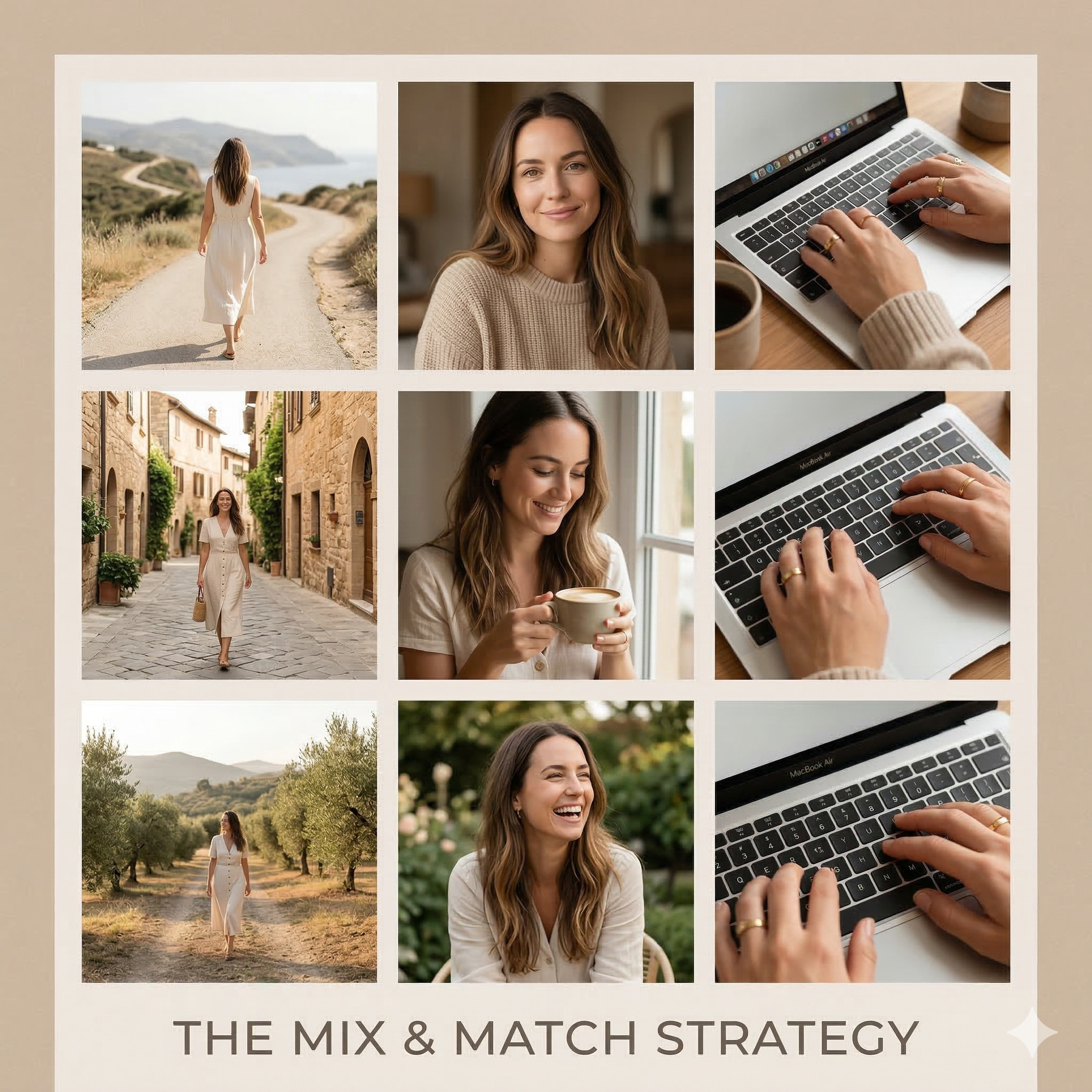
1. The "Mix & Match" Layout
If your profile feels boring or overwhelming, it's probably suffering from the "broken record" effect — too many talking-head videos or selfies shot from the exact same distance. A good feed needs rhythm.
To fix this, treat your grid like a chessboard and alternate between these four types of shots:
You taking up only 10–20% of the frame — like walking down the street or sitting in a café. This adds scale and a sense of freedom to your grid.
A classic waist-up view. Great for showing action, like working on your laptop or holding your coffee.
Just your face and shoulders. Use this to build trust and show genuine emotion — this is the shot that makes people feel like they know you.
Shots with no face at all. Just your hands on a keyboard, a cozy sweater texture, or a beautifully styled notebook.
Never place two identical shot types next to each other. If you just posted a close-up, make your next post a macro detail or a wide shot. This single habit will transform how your grid feels — immediately.
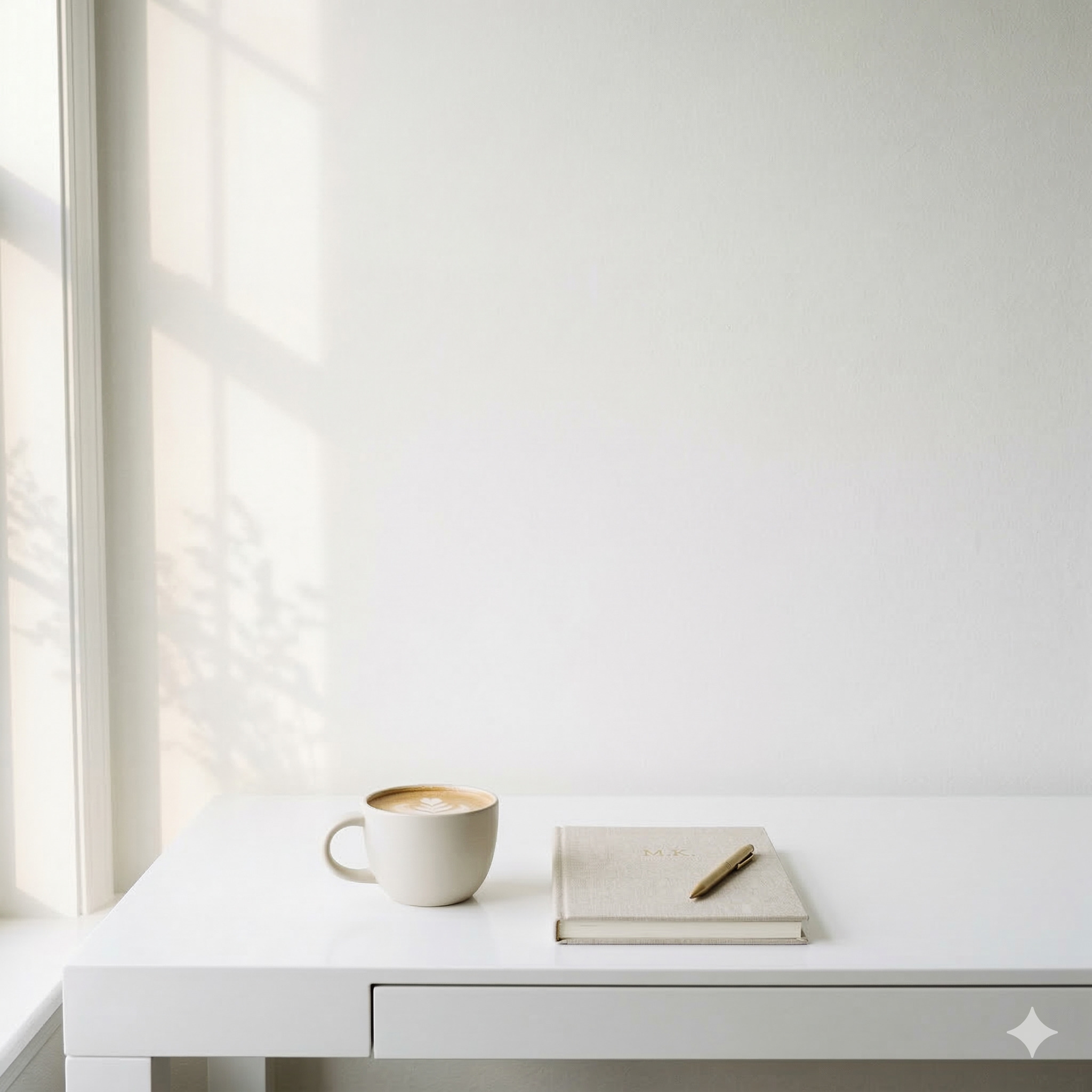
2. The "Breath of Air" Layout
Have you ever noticed the difference between a high-end boutique and a crowded discount store? The boutique has empty space around its items — and that space is what instantly signals value.
Your Instagram grid works the same way. If every single square is packed with bold text, bright colors, and close-up faces, the visitor's brain gets exhausted. You need to intentionally add "air" to your layout.
You can do this using Fillers — shots featuring negative space. Here's what that looks like in practice:
Simple, clean, and incredibly effective. A neutral wall instantly elevates everything around it.
Shoot upward. The open sky gives your grid breathing room and a sense of light and openness.
One object, minimal background. That's it. These posts aren't meant to go viral — their only job is to give your viewer's eyes a place to rest.
Negative space isn't wasted space. It's what makes everything around it feel more premium. When your feed feels calm and intentional, people stay longer — and trust you faster.
3. The "Hook & Aesthetic" Reel Cover Layout
Instagram isn't just photos anymore — it's a heavily video-first platform. But the rules of aesthetics still apply to your Reel covers.
If you post five Reels in a row with massive, brightly colored text hooks, your profile will look like a stressful bulletin board. If you only post pretty, text-free photos, no one will know what your videos are about.
The fix is simple — alternate between two types of covers:
|
The Hook Cover A bold, highly readable headline on the cover to drive clicks. Your viewer should immediately understand what they'll learn from watching.
|
The Aesthetic Cover A beautiful medium or macro shot with zero text to build your brand's mood. It gives the eye a visual break between the text-heavy covers.
|
Always double-check your covers using the "Edit Profile Grid" crop tool in Instagram. Make sure your face or key text doesn't get awkwardly chopped off in the 4:5 square view. It takes 10 seconds — and saves you from a grid that looks sloppy.
You don't need a perfect life to have a beautiful feed.
You just need a system.
Ready to build the whole system?
Your grid is one piece. Here's how to take the next step.
|
Option A — The Blueprint The Start From Zero Blueprint
If you love this approach and want the full step-by-step system, grab THE START FROM ZERO BLUEPRINT. It's the exact method I used to build my community from scratch — without the overwhelm. Get the Blueprint for $99 Yes, I'm ready |
Option B — Free Course FREE 7-Day Email Course
Not ready to dive in yet? No problem. Join my FREE 7-Day Email Course and get your first growth wins delivered straight to your inbox. Start for Free Sign me up |